Supreme Fall 2026 tees: seven graphics, two release dates
Supreme announces seven graphic tees for October 8, followed by Asia on October 10. Compare the exact designs, pictured colors and differing logo treatments.

Supreme’s seven new Fall graphic tees are announced for October 8, 2026, with the Asia release following on October 10. The official announcement supplies those dates; it does not state a release clock, retail prices, fabric specifications or a complete size list. The pictured colors below are the exact announcement previews, rather than a promise that every size or color is available.
Modern Notoriety’s collection report identifies the designs as Jim, Paris, Growl, Tears, Pills, Script and Sharp. Its artist credits identify Rob Pruitt with Paris, David Gonzales with Tears and Art Dealer with Sharp. Supreme’s official gallery shows the seven graphics individually. Read the names alongside the pictures: a design title and the color worn beneath it are separate collecting choices.
Portrait and drawing: Jim versus Paris
The blue Jim preview puts a black-and-white portrait beneath a compact blackletter Supreme heading, with a butterfly below. The report identifies the portrait subject as Jim Morrison. Most of the shirt remains uninterrupted blue, so the graphic reads as a centered image rather than an overall pattern.
Paris is pictured in orange, with a loose line drawing, a pink teddy bear and handwritten marks around the figure. The report identifies Paris Hilton as the subject and credits the artwork to Rob Pruitt. Compared with Jim’s photographic rectangle, the drawing has a more open edge: writing and figure occupy the same small central area without a strong enclosing frame. That difference changes the way the graphics sit on the shirt, even before choosing a color.
Two different uses of the Supreme name
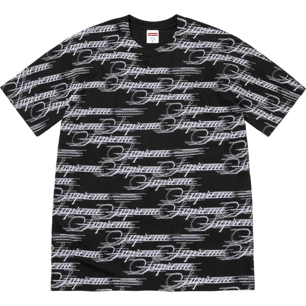
Script uses repeated pale cursive lettering across a black shirt. The wordmark becomes a pattern that reaches much further across the garment than the other central graphics. Its collecting distinction is the repeated surface, rather than one isolated logo placement.
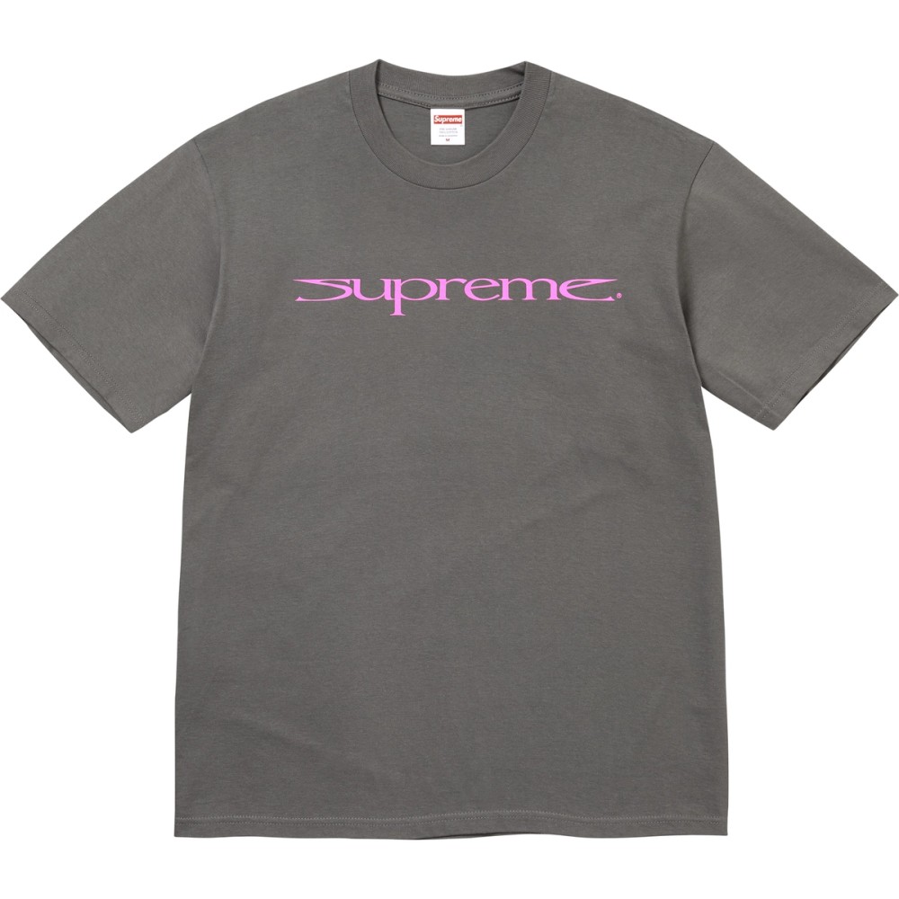
Sharp, shown in charcoal with a pink wordmark, makes the opposite choice. Its stretched letters form one narrow horizontal graphic across the chest, leaving the rest of the front visually quiet. The reported Art Dealer credit belongs to this design. Comparing Script and Sharp is therefore more useful than grouping both simply as logo tees: repetition fills the surface in one, while elongation changes a single wordmark’s shape in the other.
Three framed images
Growl is shown in burgundy. A barred dog image sits beneath bold Supreme lettering, with a small caption beneath the photograph. The bars become part of the picture’s internal structure; the typography above and below provides an additional frame. The report calls the design Growl, which helps distinguish this exact image from the capsule’s other photographic graphics.
Tears is pictured on black, with a grayscale sculptural group and ornamental elements arranged vertically. The short Mother’s Day heading sits above the image, and the Supreme name appears at the base. The report credits David Gonzales. Its tall composition differs from Growl’s compact photo-and-caption panel: the figure, surrounding ornament and base make one central pictorial object.
Pills is shown on green, with a dense rectangular arrangement of prescription bottles. At the scale of the official preview, the patchwork of labels and orange containers creates much of the visual texture. Unlike Script, that repetition stays inside a defined rectangle instead of extending across the shirt. The announcement image establishes the depicted front graphic, not a claim about medical products or the shirt’s materials.
Choose the graphic before assuming the garment details
This release combines distinct kinds of image-making: portrait photography, drawing, sculptural imagery, repeated objects and two typography treatments. The differences are visible in the official previews; print technique, fabric weight and exact fit are not established by those pictures. A central graphic and an all-over-looking front pattern should consequently be compared as design choices, without assuming they use the same production method.
Use the linked exact previews to identify the intended design, then check Supreme’s actual offer for the size, color, price and purchase conditions. The two announced dates describe separate regional milestones; neither supplies a guaranteed allocation or a sellout prediction. Explore Supreme’s wider clothing and collaboration history for the brand context behind these graphic choices.
Explore the variants
Supreme Jim Tee — Fall 2026
 RELEASE RADAR HQ
One of Supreme’s seven announced Fall 2026 graphic tees, releasing October 8, with Asia following October 10. Jim Tee is the reported design name; pictured preview: Blue.
- Season
- Fall/Winter 2026
- Collection Name
- Fall Tees 2026
- Garment Type
- Graphic T-shirt
- Colorways
- Pictured preview: Blue; complete offered colors unconfirmed
Supreme Script Tee — Fall 2026
 RELEASE RADAR HQ
One of Supreme’s seven announced Fall 2026 graphic tees, releasing October 8, with Asia following October 10. Script Tee is the reported design name; pictured preview: Black / white script.
- Season
- Fall/Winter 2026
- Collection Name
- Fall Tees 2026
- Garment Type
- Graphic T-shirt
- Colorways
- Pictured preview: Black / white script; complete offered colors unconfirmed
Supreme Paris Tee — Fall 2026
 RELEASE RADAR HQ
One of Supreme’s seven announced Fall 2026 graphic tees, releasing October 8, with Asia following October 10. Paris Tee is the reported design name; pictured preview: Orange.
- Season
- Fall/Winter 2026
- Collection Name
- Fall Tees 2026
- Garment Type
- Graphic T-shirt
- Colorways
- Pictured preview: Orange; complete offered colors unconfirmed
Supreme Sharp Tee — Fall 2026
 RELEASE RADAR HQ
One of Supreme’s seven announced Fall 2026 graphic tees, releasing October 8, with Asia following October 10. Sharp Tee is the reported design name; pictured preview: Charcoal / pink wordmark.
- Season
- Fall/Winter 2026
- Collection Name
- Fall Tees 2026
- Garment Type
- Graphic T-shirt
- Colorways
- Pictured preview: Charcoal / pink wordmark; complete offered colors unconfirmed
Supreme Growl Tee — Fall 2026
 RELEASE RADAR HQ
One of Supreme’s seven announced Fall 2026 graphic tees, releasing October 8, with Asia following October 10. Growl Tee is the reported design name; pictured preview: Burgundy.
- Season
- Fall/Winter 2026
- Collection Name
- Fall Tees 2026
- Garment Type
- Graphic T-shirt
- Colorways
- Pictured preview: Burgundy; complete offered colors unconfirmed
Supreme Tears Tee — Fall 2026
 RELEASE RADAR HQ
One of Supreme’s seven announced Fall 2026 graphic tees, releasing October 8, with Asia following October 10. Tears Tee is the reported design name; pictured preview: Black.
- Season
- Fall/Winter 2026
- Collection Name
- Fall Tees 2026
- Garment Type
- Graphic T-shirt
- Colorways
- Pictured preview: Black; complete offered colors unconfirmed
Supreme Pills Tee — Fall 2026
 RELEASE RADAR HQ
One of Supreme’s seven announced Fall 2026 graphic tees, releasing October 8, with Asia following October 10. Pills Tee is the reported design name; pictured preview: Green.
- Season
- Fall/Winter 2026
- Collection Name
- Fall Tees 2026
- Garment Type
- Graphic T-shirt
- Colorways
- Pictured preview: Green; complete offered colors unconfirmed
Sources & verification
- Supreme Fall Tees ↗official · checked Oct 8, 2026
- Supreme Lines Up Seven Fall 2026 Tees ↗independent reporting · checked Oct 8, 2026
- Supreme Fall Tees official gallery image 8 ↗official · checked Oct 8, 2026
- Supreme Fall Tees official gallery image 9 ↗official · checked Oct 8, 2026
- Supreme Fall Tees official gallery image 10 ↗official · checked Oct 8, 2026
- Supreme Fall Tees official gallery image 11 ↗official · checked Oct 8, 2026
- Supreme Fall Tees official gallery image 12 ↗official · checked Oct 8, 2026
- Supreme Fall Tees official gallery image 13 ↗official · checked Oct 8, 2026
- Supreme Fall Tees official gallery image 14 ↗official · checked Oct 8, 2026
- EssilorLuxottica to Acquire Supreme from VF Corporation ↗official · checked Oct 4, 2026
Supreme
Explore the catalog
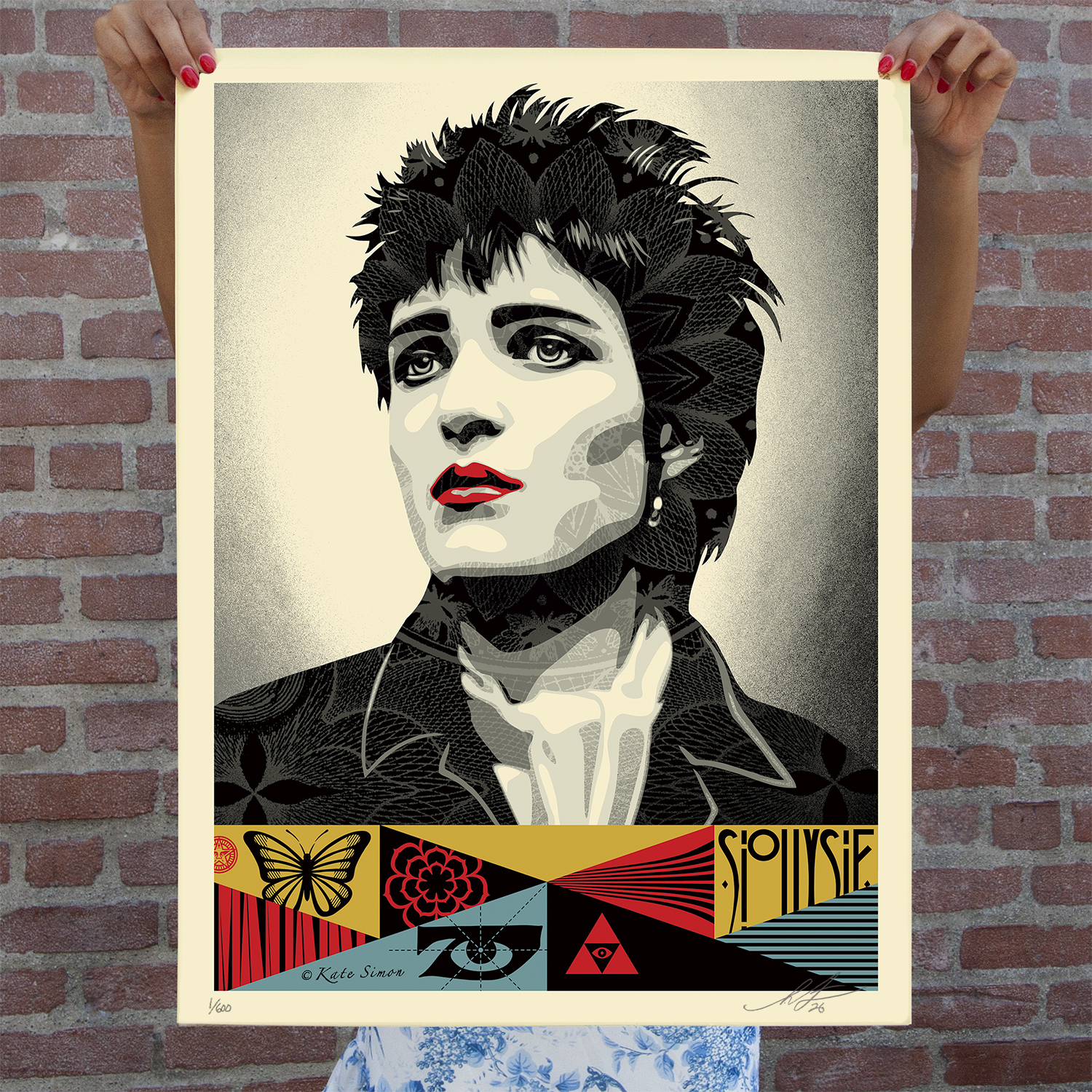
Shepard Fairey — Siouxsie, 1978
Shepard Fairey Siouxsie, 1978: US $85, signed and numbered edition of 600. Releases October 9, 2026 at 10 a.m. PDT; 24 × 18 inches on cream Speckletone.
Read the story ↗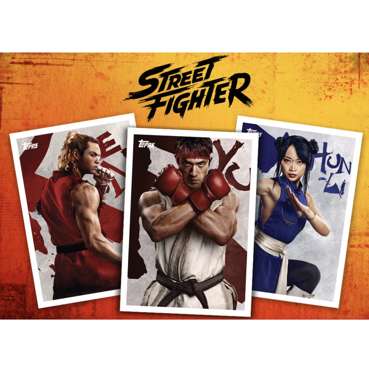
2026 Topps X Street Fighter
2026 Topps X Street Fighter. Preorder October 9, 2026. Configuration details pending.
Read the story ↗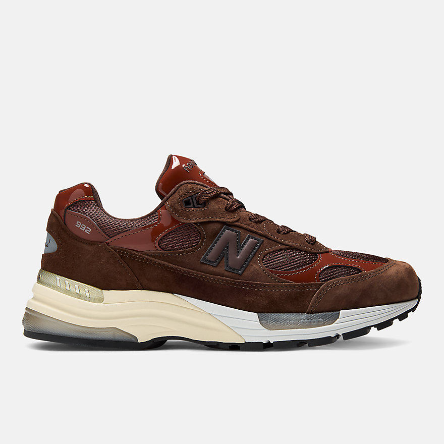
Aminé x New Balance Made in USA 992 — Brown (U992NE)
Aminé’s Outdoor School-inspired 992 uses brown pig suede, patent overlays and custom packaging. US calendar lists October 9; Japan and Hong Kong have separate times and prices.
Read the story ↗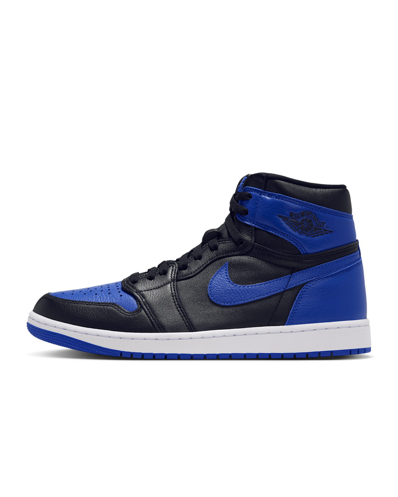
Air Jordan 1 High OG Royal (2026, adult)
The adult Royal returns October 10 for $185 through US SNKRS. Its original-colorway appeal differs from Royal Reimagined, and kids’ versions carry separate codes and prices.
Read the story ↗Supreme Growl Tee — Fall 2026
One of Supreme’s seven announced Fall 2026 graphic tees, releasing October 8, with Asia following October 10. Growl Tee is the reported design name; pictured preview: Burgundy.
Read the story ↗Supreme Jim Tee — Fall 2026
One of Supreme’s seven announced Fall 2026 graphic tees, releasing October 8, with Asia following October 10. Jim Tee is the reported design name; pictured preview: Blue.
Read the story ↗Supreme Paris Tee — Fall 2026
One of Supreme’s seven announced Fall 2026 graphic tees, releasing October 8, with Asia following October 10. Paris Tee is the reported design name; pictured preview: Orange.
Read the story ↗Supreme Pills Tee — Fall 2026
One of Supreme’s seven announced Fall 2026 graphic tees, releasing October 8, with Asia following October 10. Pills Tee is the reported design name; pictured preview: Green.
Read the story ↗Supreme Script Tee — Fall 2026
One of Supreme’s seven announced Fall 2026 graphic tees, releasing October 8, with Asia following October 10. Script Tee is the reported design name; pictured preview: Black / white script.
Read the story ↗Supreme Sharp Tee — Fall 2026
One of Supreme’s seven announced Fall 2026 graphic tees, releasing October 8, with Asia following October 10. Sharp Tee is the reported design name; pictured preview: Charcoal / pink wordmark.
Read the story ↗Supreme Tears Tee — Fall 2026
One of Supreme’s seven announced Fall 2026 graphic tees, releasing October 8, with Asia following October 10. Tears Tee is the reported design name; pictured preview: Black.
Read the story ↗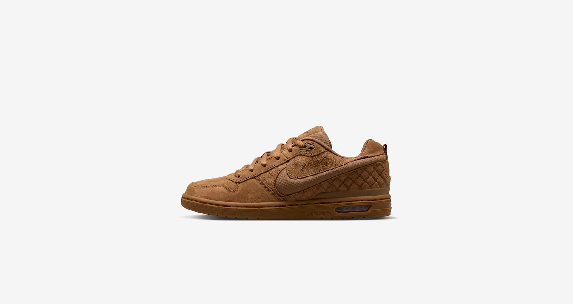
Nike Paul Rodriguez Zoom Air Low — Ale Brown
Nike Paul Rodriguez Zoom Air Low — Ale Brown (IQ6827-200): 125 USD. US launch October 13, 2026 at 10:00 ET. See sizing and exact release details.
Read the story ↗